| This article needs additional citations for verification. Please help improve this article by adding citations to reliable sources. Unsourced material may be challenged and removed. Find sources: "Disclosure widget" – news · newspapers · books · scholar · JSTOR (April 2015) (Learn how and when to remove this message) |

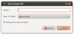
A disclosure widget, expander, or disclosure triangle is a graphical control element that is used to show or hide a collection of "child" widgets in a specific area of the interface. The widget hides non-essential settings or information and thus makes the dialog less cluttered.
The disclosure widget may be expanded or collapsed by the user; when this occurs, the containing window may be expanded to accommodate the increased space requirement. The state of the widget is often signified by a label with a triangle next to it, pointing sideways when it is collapsed and downward when it is expanded (corresponding to the widget's current state), or a button with an arrow pointing downward when it is collapsed and upward when it is expanded (corresponding to how the widget will change state if the button is clicked). Some disclosure widgets can appear as a plus button when collapsed and a minus button when expanded.
In some implementations, the widget may be able to remember its state between invocations; this may increase user familiarity with the interface. In other implementations, the widget may disappear when clicked in order to make room for the newly revealed controls; this state is not remembered.
Some user interface designers call this widget a "norgie", or "twistie".
See also
| Graphical control elements | |
|---|---|
| Command input | |
| Data input-output | |
| Informational | |
| Containers | |
| Navigational | |
| Special windows | |
| Related concepts | |
References
- "Modify "Wiki" and "Blog" in wiki header | Communities". discussions.apple.com. Archived from the original on 2017-01-15.
- "IBM: Techdocs - the Technical Sales Library". 19 February 2021. Archived from the original on October 24, 2005.