| This article needs additional citations for verification. Please help improve this article by adding citations to reliable sources. Unsourced material may be challenged and removed. Find sources: "VAG Rounded" – news · newspapers · books · scholar · JSTOR (January 2023) (Learn how and when to remove this message) |
 | |
| Category | Sans-serif |
|---|---|
| Designer(s) | Gerry Barney et al. |
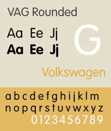
VAG Rundschrift or VAG Rounded (Rundschrift is German for 'round typeface', short of abgerundete Schrift, 'rounded typeface') is a geometric sans-serif typeface that was designed as a corporate typographic voice for the Volkswagen AG motor manufacturer. It resembles Futura, but features rounded terminals on all strokes.
Volkswagen stopped using the VAG Rounded family in the early 1990s, and it is widely available today, licensed through Adobe Systems.
History
| This section does not cite any sources. Please help improve this section by adding citations to reliable sources. Unsourced material may be challenged and removed. (January 2023) (Learn how and when to remove this message) |
In 1964, Volkswagen AG bought Auto Union GmbH from Daimler Benz. The main active brand of Auto Union was DKW, but it was soon dropped by Volkswagen and replaced by Auto Union's dormant Audi brand. In the early 1970s, the dealer organizations of Volkswagen and Audi merged. In the following years, Volkswagen AG re-thought their future strategy. The Volkswagen brand was associated mainly with compact cars, but Audi would allow it to expand to larger and more upmarket models - although at this time Audi was still not regarded as a premium brand.
They envisioned buying several car companies to round out their offerings. They also envisioned selling a multitude of brands under giant dealer roofs. The new dealer organization, financial services, and all other non-car related activities were to come under one branded umbrella. Eventually, Volkswagen intended to use this umbrella as the name of their holding company: General Motors in reverse.
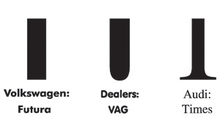
GGK Düsseldorf was tasked with the branding concept. Finding a distinct typeface was an integral part. Volkswagen at the time had Futura as their typeface. Audi at the time used Times. The new typeface would be neither sans-serif (like Futura) nor serif (like Times), and the idea for a rounded typeface was born. After the company failed to find an existing rounded typeface at the time, the new typeface had to be developed. The original idea was conceived by Wolf Rogosky (creative director) and Gerd Hiepler (art director). Over several years, the identity concept was refined by Bertel Schmitt (creative director) and Manfred Schwarzer (art director). The original typeface was rendered by hand. It was then perfected on a PDP-8 minicomputer.

In 1978, the whole Volkswagen and Audi Dealer Organization worldwide was re-branded as V.A.G using the distinct V.A.G Rounded (or V.A.G Rundschrift) as the font for all signage, and for all headlines in their advertising. The V.A.G logo did not use the font. Worldwide availability of the font was a problem. To solve the problem, V.A.G Rounded was put in the public domain. As Desktop Publishing emerged in the mid-1980s, V.A.G Rounded was included in most free font packages and became widely used for that reason. A free modern implementation is MgOpen Modata.
VAG
The meaning of V.A.G was never officially disclosed. Theories ranged from "Volkswagen AG" (although the official name of the company during this time was "Volkswagenwerk AG") to "Volkswagen Audi Group." At Volkswagen, insiders joked that V.A.G means Von Adolf Gegründet ("Founded by Adolf"). Bertel Schmitt revealed that the V.A.G name was intentionally ambiguous to avoid rewriting dealer contracts as a legal consequence of the holding company's name change.

By 1994, in line with Volkswagen's long-term aim of pushing the Audi brand further upmarket towards being a full scale luxury brand on level terms with BMW and Mercedes-Benz, it was decided to separate the joint sales channel used by VW and Audi, and establish a wholly independent Audi dealer network. This was essentially the end of the V.A.G brand and logo, which was abandoned shortly afterwards, with the process being completed by 1997. Audi overhauled its corporate identity around the same time, dropping the "Audi Oval" logo that had been in use since the late 1970s, giving prominence to the four rings, and replacing Times with the Univers font for all corporate communications.
Yet, with Audi, Bugatti, Bentley, Lamborghini, SEAT, Škoda, Scania and MAN, Volkswagen AG had realized its vision of many brands. The vision of many brands under one huge roof was left to the auto malls that became common in the US and later in Europe. One ambiguity which remains from the era of V.A.G is that many parts on Volkswagen Group vehicles - regardless of brand - are still stamped with the logos of both Volkswagen and Audi - thus suggesting that the dominance of the two brands is intentional, giving weight to the former argument that V.A.G did indeed stand for "Volkswagen Audi Group" or perhaps Volkswagen Auto Group.
Usage
The typeface was used for the Volkswagen and Audi Dealer Organization, and for all non-car related activities of Volkswagen, such as the V.A.G Bank and V.A.G Leasing. The typeface was conceived in a general overhaul of Volkswagen's corporate identity.

With many Web 2.0 startups circa 2006, a clear trend in their new logos is the use of soft, rounded typefaces dominated by VAG Rounded, which is said to "lend a modern friendliness to what might otherwise be a cold trademark" and, as of 2007, can be seen on T-Mobile USA literature. Apple Inc. utilized the typeface on the keyboards of their line of laptop computers since 1999, with the release of the first-generation iBook, and on their desktop keyboards since August 2007. In 2015, Apple replaced VAG Rounded with its own font, San Francisco. Australian retailer Big W has changed their logo (previously in Helvetica Neue) to light blue VAG Rounded. Dick Smith, as part of the Woolworths Limited Group, use this font in most of their advertising. Bankwest also use this font for their "Happy Banking Initiative". As of Late 2006, Adecco use the font in their publications and advertisements. It also used on early episodes of BrainPOP.
VAG Rounded is one of the fonts used in Rede Globo and is also used for the logo and many in store elements in the British toy retailer The Entertainer.
Also, the typeface was used by Jollibee as a secondary text for its menu, and used a modified version of the font as the typeface of its famous logo, accompanied by the famous "Jollibee face" symbol, first used in 1997. The text and the symbol were again modified in 2011, as Jollibee unveiled a new logo that year.
Since the 2010s, the bold variant of VAG Rounded became the regular typeface for letters, numbers, and other text on Sesame Street, coincidentally replacing its precursor, Futura, which had been used on the show for decades prior. Much like with Futura, some of the letters were altered to be more distinguishable to children (ex. serifs on the "I" and a proper tail on the "j").
VAG Rounded was used by the West Midlands Passenger Transport Executive from 2005 on public transport infrastructure until it was replaced by a custom typeface (derived from VAG), Network.
As of version 13.0.1, VAG Rounded is also used by Twemoji in a variety of letter-based emojis, such as Regional indicator symbols.
In Czech, it was used in Pat & Mat and some shows that used this font, especially cartoons like Zdenek Vins' Barevnost.
References
- Schmitt, B. (2009). VW/Porsche: Auto Union? What the NSFW?. The Truth About Cars. Retrieved May 17, 2009, from thetruthaboutcars.com
- Erdmann, Thomas; Friese, Ralf; Kirchberg, Peter; Plagmann, Ralph (May 2009). Four Rings - The Audi Story. Audi AG / Auto Union GmbH. p. 254. ISBN 978-3-7688-2673-0.
- The Fontfeed, March 7, 2006. fontshop.com
- "Apple MacBook Keyboard 2015". 11 March 2015.
- "Archived copy". www.brainpop.com. Archived from the original on 23 August 2000. Retrieved 12 January 2022.
{{cite web}}: CS1 maint: archived copy as title (link)
External links
- "Typographic Abbreviations Series #2: VAG" from the MyFonts blog, 2006-11-17, retrieved 2007-05-25