This is an old revision of this page, as edited by Farry (talk | contribs) at 08:42, 26 September 2012 (→History: Historical usage of long-s diagram). The present address (URL) is a permanent link to this revision, which may differ significantly from the current revision.
Revision as of 08:42, 26 September 2012 by Farry (talk | contribs) (→History: Historical usage of long-s diagram)(diff) ← Previous revision | Latest revision (diff) | Newer revision → (diff) The correct title of this article is ſ. It appears incorrectly here due to technical restrictions.
The long, medial or descending s (ſ) is a form of the minuscule letter s formerly used where s occurred in the middle or at the beginning of a word, for example "ſinfulneſs" ("sinfulness"). The modern letterform was called the terminal, round, or short s.
History


The long s was derived from the old Roman cursive medial s. When the distinction between upper case (capital) and lower case (small) letter-forms became established, towards the end of the eighth century, it developed a more vertical form. In this period it was occasionally used at the end of a word, a practice which quickly died out but was occasionally revived in Italian printing between about 1465 and 1480. Thus the general rule that the long 's' "never occurred at the end of a word" is not strictly correct, although the exceptions are rare and archaic. In German written in Blackletter, the rules are more complicated: short s also appears at the end of each word within a compound word.
The long s is subject to confusion with the lower case (or minuscule) f, sometimes even having an f-like nub at its middle, but on the left side only, in various roman typefaces and in blackletter. There was no nub in its italic typeform, which gave the stroke a descender curling to the left—not possible with the other typeforms mentioned without kerning. For this reason, the short s was also normally used in combination with f: for example, in "ſatisfaction".
The nub acquired its form in the blackletter style of writing. What looks like one stroke was actually a wedge pointing downward, whose widest part was at that height (x-height), and capped by a second stroke forming an ascender curling to the right. Those styles of writing and their derivatives in type design had a cross-bar at the height of the nub for letters f and t, as well as k. In roman type, these disappeared except for the one on the medial s.
The long s was used in ligatures in various languages. Three examples were for si, ss, and st, besides the German letter ß.
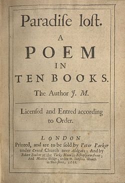
The long s fell out of use in roman and italic typefaces well before the middle of the 19th century. In Spain the change was mainly accomplished between the years 1760 and 1766; in France, the change occurred between 1782 and 1793; in Britain and the United States, between 1795 and 1810. For example, in Spain, the multi-volume work España Sagrada made the switch with volume 16 (1762); The Times of London switched to the short s with its issue of September 10, 1803; and in the United States, acts of Congress were published with the long s throughout 1803, switching to the short s in 1804. But Britain's colony Nova Scotia's statutes used the long "s" as late as 1816.
This change may have been spurred by the fact that long s looks somewhat like an f (in both its roman and italic forms), whereas short s did not have this disadvantage, making it easier to identify, especially for people with problems of vision.
Despite its disappearance from printed works, in England the long s survived in handwriting into the 1860s. The long s survives in Fraktur typefaces.
When a font containing the long s is used, German typographic rules require the common s to be used when it occurs singly at the end of a syllable, while the long s is used at the beginning of a syllable (more detailed rules are given for other cases).
Greek also features a normal sigma σ and a special terminal form ς, which may have supported the idea of such specialized s forms. In Renaissance Europe a significant fraction of the literate class was familiar with Ancient Greek.
The present-day German letter ß (das Eszett "the ess-zed", or scharfes-ess "the sharp S"; also used in Low German and historical Upper Sorbian orthographies) is considered to have originated in a ligature of ſz (which is supported by the fact that the second part of the ß glyph usually resembles a Fraktur z), or ſs (see ß for more), or some Tironian notes.
Some old orthographic systems of Slavonic and Baltic languages used ſ and s as two separate letters with different phonetic value. For example, the Bohorič alphabet of Slovene language included ſ /s/, s /z/, ſh /ʃ/, sh /ʒ/. In the original version of the alphabet, uppercase S was shared by both letters, later a modified character Ş became counterpart of ſ.
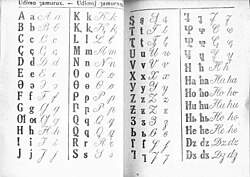
Also, some Latin alphabets devised in the 1920s for some Caucasian languages used the ſ for some specific sounds. These orthographies were in actual use until 1938. Some of these had developed a capital form which roughly resembles a smoothed variant of the letter U+0295 ʕ LATIN LETTER PHARYNGEAL VOICED FRICATIVE.

Modern usage

The long s is represented in Unicode at the code point U+017F in the Latin Extended-A range, and it may be represented in HTML as ſ or ſ.
The long s survives in elongated form, and with an italic-style curled descender, as the integral symbol ∫ used in calculus; Gottfried Wilhelm von Leibniz based the character on the Latin word summa ("sum"), which he wrote ſumma. This use first appeared publicly in his paper De Geometria, published in Acta Eruditorum of June 1686, but he had been using it in private manuscripts at least since 1675. The following represents the integral of a function of x over the interval :
In linguistics a similar character (ʃ, called "esh") is used in the International Phonetic Alphabet, in which it represents the voiceless postalveolar fricative, the first sound in the English word shun.
In Scandinavian and German-speaking countries, relics of the long s continue to be seen in signs and logos that use various forms of fraktur typefaces. Examples include the logos of the Norwegian newspapers Aftenpoſten and Adresſeaviſen; the packaging logo for Finnish Siſu pastilles; and the Jägermeiſter logo.
The similarity between the printed long s (ſ) and f and modern-day unfamiliarity with the former letter-form has been the subject of much humour based on the intentional misreading of s as f, e.g. pronouncing Greensleeves as Greenfleeves and song as fong in a Flanders and Swann monologue.
Another survival of the long s was the abbreviation used in British English for shilling, as in "5/–", where the shilling mark "/" stood in for the long s which had been long forgotten by all but antiquarians.
See also
- ß (Eszett)
- Esh (letter)
- Integral sign
- R rotunda
Notes
- Lyn Davies. A is for Ox, London: 2006. Folio Society.
- Max Bollwage: Ist das Eszett ein lateinischer Gastarbeiter?. In: Gutenberg-Jahrbuch 1999 (Mainz (Germany), ISBN 3-7755-1999-8), p. 35–41. Cited and discussed in: Uta Stötzner: Die Geschichte des versalen Eszetts. In: Signa, vol. 9. p. 21–22. Grimma (Germany) 2006, ISBN 3-933629-17-9
- Proposal to encode Latin letters used in the Former Soviet Union (in Unicode)
- Andreas Frings: Sowjetische Schriftpolitik zwischen 1917 und 1941 – eine handlungstheoretische Analyse. Stuttgart (Germany) 2007, ISBN 978-3-515-08887-9
- Mathematics and its History, John Stillwell, Springer 1989, p. 110
- Early Mathematical Manuscripts of Leibniz, J. M. Child, Open Court Publishing Co., 1920, pp. 73–74, 80.
- "The Greensleeves Monologue Annotated".
- Fowler, Francis George. "long+s"+shilling The concise Oxford dictionary of current English. p. 829.
External links
- James Mosley on long s
- The Straight Dope on long s
- Andrew West, The Rules for Long S
- Andrew West, The Long and the Short of the Letter S
- The American Declaration of Independence with long s's
| Latin script | |||||||||||||||||||||||||||||||||||||||||||||||||||||
|---|---|---|---|---|---|---|---|---|---|---|---|---|---|---|---|---|---|---|---|---|---|---|---|---|---|---|---|---|---|---|---|---|---|---|---|---|---|---|---|---|---|---|---|---|---|---|---|---|---|---|---|---|---|
| Alphabets (list) | |||||||||||||||||||||||||||||||||||||||||||||||||||||
| Letters (list) |
| ||||||||||||||||||||||||||||||||||||||||||||||||||||
| Multigraphs |
| ||||||||||||||||||||||||||||||||||||||||||||||||||||
| Keyboard layouts (list) | |||||||||||||||||||||||||||||||||||||||||||||||||||||
| Historical Standards | |||||||||||||||||||||||||||||||||||||||||||||||||||||
| Current Standards | |||||||||||||||||||||||||||||||||||||||||||||||||||||
| Lists | |||||||||||||||||||||||||||||||||||||||||||||||||||||
