 | |
| Category | Sans-serif |
|---|---|
| Designer(s) | Hermann Hoffmann |
| Foundry | H. Berthold |
| Date created | 1908 |
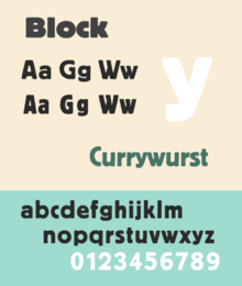
Berthold Block is a sans-serif typeface released by the H. Berthold foundry in the early twentieth century and intended for display use. Block has a chunky design suitable for headings, with short descenders allowing tight linespacing and rounded corners. It is sometimes simply called "Block". Font design expert Stephen Coles describes it as "a soft but substantial display face with compact dimensions and an organic appearance… isn’t meant for body copy." The Klingspor Museum credits it to Hermann Hoffmann, who managed type design for Berthold.
The original metal type release of Block was intentionally "distressed" in style, matching the effect of worn type; some re-releases have a cleaner design. Ferdinand Ulrich suggests that this was to match the organic feel of advertising lettering of the time, including the work of Lucian Bernhard. Block was one of Berthold's most popular typefaces, and was released in a wide range of versions, including lighter weights and type in wood (for large sizes). Metal type versions had stylistic alternate characters such as a more compact 'S' to allow fine-tuning of appearance of type and fit the desired number of characters into a line.
History

Berthold Block was released in 1908; Berthold later added additional weights and styles, also releasing phototypesetting versions. Berthold also used the name "Block" for a number of other typefaces not particularly closely related to it as a brand extension marketing strategy. These included the script font "Block-Signal" and the blackletter Block-Fraktur.
Block continued to be popular in the phototypesetting period; Jens Gehlhaar comments that "with roughened outlines and in bold weights, it was never a candidate for timelessness, but its big x-height and tight fit made it quite popular in 1970s Germany and England." It was often used by Praktiker and by the Whitechapel Art Gallery for branding in the 1970s and 80s. In the late 1970s, Berthold re-released three lighter-weight fonts derived from the Block design as a mini-family named "Berliner Grotesk" for phototypesetting, with the font redraw carried out by Erik Spiekermann.
Digitisations

A variety of digitisations of Block exist, including by Berthold and successor companies and by Bitstream (the condensed weight only). Paratype of Moscow released an expansion with Cyrillic characters in 1997. Matthew Butterick's Hermes, first released by Font Bureau and later self-released, is a loose adaptation also inspired by other German grotesque typefaces of the period, adding lighter weights and unicase features.
References
- ^ "Block - Fonts in Use". Fonts In Use. Retrieved 12 June 2016.
- ^ Safayev, Tagir. "Paratype Bloc". Paratype. Retrieved 12 June 2016.
- "Block Berthold". Typewolf. Retrieved 12 June 2016.
- Coles, Stephen (4 June 2015). "In Pieces website". Fonts In Use. Retrieved 12 June 2016.
- "H. Berthold AG" (PDF). Klingspor Museum. Retrieved 12 June 2016.
- Devroye, Luc. "Hermann Hoffmann". Type Design Information. Retrieved 12 June 2016.
- ^ Ulrich, Ferdinand. "From Condensed Light to Extended Ultra". FontShop. Retrieved 19 August 2017.
- "Block in Stahl-Typen". Flickr. 21 February 2012. Retrieved 17 December 2016.
- Coles, Stephen; Hardwig, Florian (21 August 2008). "Berthold Block & Berliner Grotesk, 1921 Specimen". Flickr. Retrieved 17 December 2016.
- "Schriftdesigner Hermann Hoffmann" (PDF). Klingspor Museum. Retrieved 12 June 2016.
- "Berthold BQ". Berthold Types. Retrieved 12 June 2016.
- Gehlhaar, Jens. "Neuwelt: An optimistic transatlantic sans serif type family — Jens Gehlhaar". Jens Gehlhaar. Retrieved 15 December 2021.
- O'Connell, Steve (6 January 2016). "Whitechapel Art Gallery". Fonts In Use. Retrieved 12 June 2016.
- Hardwig, Florian (11 July 2013). "Praktiker". Fonts In Use. Retrieved 12 June 2016.
- ^ "Berliner Grotesk BQ". MyFonts. Retrieved 21 August 2017.
- "Block Berthold BE". MyFonts. H. Berthold. Retrieved 12 June 2016.
- Ruecha, Stawix. "Amsi Pro (Block digitisation)". MyFonts. Stawix. Retrieved 12 June 2016.
- "Condensed Gothic 821". MyFonts. Bitstream. Retrieved 12 June 2016.
- Butterick, Matthew. "Hermes Maia ‹ MB Type". MB Type. Retrieved 15 December 2021.
- Butterick, Matthew. "Hermes FB". Font Bureau. Retrieved 12 June 2016.
- Sources vary on release date giving 1978 and 1979.
External links
- 1921 Berthold Block specimen (digitisation: Stephen Coles)
- Fonts In Use