 | |
| Category | Serif |
|---|---|
| Classification | Old-style, Venetian |
| Designer(s) | Bruce Rogers Frederic Warde Nicolas Jenson Ludovico Vicentino degli Arrighi |
| Foundry | Monotype Corporation |
| Date created | 1914 |
| Date released | 1929 |
| Also known as | Metropolitan |
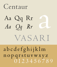
Centaur is a serif typeface by book and typeface designer Bruce Rogers, based on the Renaissance-period printing of Nicolas Jenson around 1470. He used it for his design of the Oxford Lectern Bible. It was given widespread release by the British branch of Monotype, paired with an italic designed by calligrapher Frederic Warde and based on the slightly later work of calligrapher and printer Ludovico Vicentino degli Arrighi. The italic has sometimes been named separately as the "Arrighi" italic.
Centaur is an elegant and quite slender design, lighter on the page than Jenson's work and most other revivals, an effect possibly amplified in the digital release compared to the metal type. It has been popular in fine book printing and is often used both for printing body text and especially titles and headings. One of its most notable uses has been in the designs of Penguin Books, who have regularly used it for titling.
Historical background

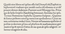
Rogers' primary influence was Nicholas Jenson's 1470 Eusebius, considered the model for the modern upright printing of the Roman alphabet, which Rogers studied through enlarged photographs. Centaur also shows the influence of types cut by Francesco Griffo in 1495 for a small book titled De Aetna written by Pietro Bembo. The typeface is classified as belonging to the humanist style of old-style designs, based on the predominant influence of Jenson's work. The style is also called Venetian for the city Jenson worked in during his career as a printer. In the late nineteenth century, Jenson's work had become a popular model for William Morris and then other fine printers of the Arts and Crafts movement. Morris commissioned a revival font copying Jenson's work, and several other revivals and imitations of Morris' work had followed by 1914.

Italic typefaces did not exist in Jenson's time, and so the inspiration for Centaur's italic comes from thirty years later, in the calligraphy and printing of Ludovico Vicentino degli Arrighi. Arrighi was a Rome-based calligrapher who made the transition to working in printing, releasing a writing manual, La operina…, and other printed works. These used an italic font presumably based on his calligraphy. It inspired later French italic types from 1528 onwards.
Revival
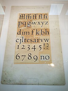
Rogers' revival was originally drawn as titling capitals in 1914 for the Metropolitan Museum of Art. Rogers later expanded it, adding lower case, for his 1915 limited edition of Maurice de Guérin's The Centaur.

For the original release, matrices were cut by Robert Wiebking and the type was privately cast by American Type Founders. Some years later, the Monotype Corporation commissioned Rogers to release it for the general market. Rogers did not feel able to create a matching italic, and asked the calligrapher Frederic Warde if he could pair Centaur with a design Warde had created based upon Ludovico Arrighi’s 1520 chancery face, made in 1926 for the Officina Bodoni. Warde's design had the separate name Arrighi, which appears in some earlier specimens.


 Centaur & Arrighi at text size
The completed family was released for general use in 1929, with a first showing in Monotype's specimen booklet The Trained Printer and the Amateur by Alfred W. Pollard. Monotype described it as a 'long-descender type of great distinction', emphasising its feeling of not having been restricted to allow tighter linespacing, as other types often had been in the hot metal period. Monotype has sold the design with bold and bold italic designs (their invention, since bold type did not exist until long after Jenson's and Arrighi's work), and swash italic alternate characters.
Centaur shows some of the irregularities of early type compared to later designs. The dots of the i and j are very visibly shifted to the right, a feature of Jenson's original design. The horizontal stroke of the 'e' is slanted, not exactly horizontal as came to be the norm in print. On the other hand, while based on study of Jenson's work, Centaur is a deliberately loose imitation, more slender (especially in the serifs) than Jenson's original. It also modernises Jenson's two-way serifs on the top of the 'M' in favour of one-way serifs. In addition, the italic capitals slope in the modern tradition, which was established after Arrighi's time in the later 16th century. Monotype advisor and historian of printing Stanley Morison, who was influential in Monotype's series of revival designs of the 1920s and 30s, described Centaur in his book A Tally of Types as "a freehand emphasis of the calligraphic basis of the original" and its modernisation "a concession to contemporary sense". Sebastian Carter calls it "an imaginative recreation".
Digitisations
Centaur has been digitised, both by Monotype in collaboration with Adobe, and by LTC, who assumed the rights to many Lanston (American) Monotype typefaces, under the name of Metropolitan. The revivals have slightly different features; Monotype’s having a bold and bold italic and swash caps and LTC’s having a more complex, less smooth digitisation with many italic alternates and complementary ornaments.
At least two open-source digital typefaces, Museum (by Raph Levien) and Coelacanth, are based on Centaur.
Related fonts
Other Monotype fonts of the hot metal period inspired by Renaissance printing included the very popular Bembo (with a roman based on a slightly later font used by Aldus Manutius), Lutetia by Jan van Krimpen (a more personal design, as opposed to a direct revival) and the post-war Dante.
Among other Venetian revivals, Adobe Jenson is a notable and extremely complete digital revival from 1996 with features such as optical size fonts for different text sizes. William Morris's Golden Type began revivals of the Jenson style in 1892 with a more solid structure (no matching italic was created for it); other Jenson interpretations included the Doves Type while ATF's Satanick was a direct imitation of it. American Type Founders' Cloister Old Style was created by its design team led by Morris Fuller Benton around 1915, during the same period as Centaur. Ludlow created another release with italic under the direction of Ernst F. Detterer and Robert Hunter Middleton in the 1920s. American Type Founders also issued a very eccentric Jenson revival inspired by the work of Morris which is little-known today. Tobias Frere-Jones created a revival in 1994 named Hightower Text that is bundled with some Microsoft software, adding his own italic design.
Usage
Outside its common uses, Centaur is also used for the wordmark of John Varvatos and in the children's book Crispin: The Cross of Lead, set in the Middle Ages.
References
- ^ Heller, Steven (13 September 2016). "The Rise of Centaur". Print. Retrieved 23 September 2016.
- Shaw, Paul. "Book Review: Type Revivals". Blue Pencil. Retrieved 19 September 2015.
- Doubleday, Richard. "Jan Tschichold at Penguin Books: A Resurgance(sic) of Classical Book Design" (PDF). Retrieved 30 June 2015.
- ^ "Facts about Centaur" (PDF). Monotype Recorder. 32 (1): 20–21. 1933. Retrieved 20 September 2015.
- ^ Shen, Juliet. "Searching for Morris Fuller Benton". Type Culture. Retrieved 11 April 2017.
- Novoa, James Nelson (2011). Zinguer, Ilana (ed.). Hebraic Aspects of the Renaissance: Sources and Encounters. Leiden: Brill. pp. 65–77. ISBN 9789004212558. Retrieved 28 December 2015.
- Arrighi, Ludovico Vicentino degli (1524). La operina di Ludouico Vicentino, da imparare di scriuere littera cancellarescha. Rome/Venice?. Retrieved 28 December 2015.
- Clayton, Ewan (2013). The Golden Thread: the story of writing. Counterpoint. pp. 128–151. ISBN 9781619023505.
- Goldberg, Jonathan (1990). Writing matter: from the hands of the English Renaissance. Stanford University Press. pp. 70–75. ISBN 9780804719582. Retrieved 28 December 2015.
- Witcombe, Christopher L.C.E. (2004). Copyright in the Renaissance: prints and the privilegio in sixteenth-century Venice and Rome. Leiden: Brill. pp. 285–286. ISBN 9789004137486. Retrieved 28 December 2015.
- Morison, Stanley; Johnson, Alfred (2009). "3: The Chancery Types of Italy and France". In McKitterick, David John (ed.). Selected essays on the history of letter-forms in manuscript and print (Paperback reissue, digitally printed version. ed.). Cambridge: Cambridge University Press. pp. 30–45. ISBN 9780521183161. Retrieved 28 December 2015.
- Vervliet, Hendrik D.L. (2008). The palaeotypography of the French Renaissance. Selected papers on sixteenth-century typefaces. 2 vols. Leiden: Koninklijke Brill NV. pp. 90–91. ISBN 9789004169821.
- The Monotype Corporation limited, specimen blade 5-64, Bembo 270
- Stössinger, Nina (9 November 2012). "Centaur". Alphabettes. Retrieved 15 May 2016.
- Middleton, R. Hunter (1937). Chicago Letter Founding. Chicago: Black Cat Press. pp. 12–22. Retrieved 9 July 2017.
- Friedl, Ott, and Stein, Typography: an Encyclopedic Survey of Type Design and Techniques Throughout History. Black Dog & Levinthal Publishers: 1998. ISBN 1-57912-023-7, pp. 540-41.
- "Centaur & Arrighi". Chestnut Press. Archived from the original on 13 January 2016. Retrieved 28 December 2015.
- ^ Stanley Morison (7 June 1973). A Tally of Types. CUP Archive. pp. 41–6. ISBN 978-0-521-09786-4.
- Alexander S. Lawson, Anatomy of a Typeface David R. Godine: 1990. ISBN 978-0-87923-333-4, pp. 92-93.
- "The Fifty Best Books exhibition" (PDF). Monotype Recorder. 29: 6–11. September 1930. Retrieved 19 September 2015.
- "Colophon" (PDF). Monotype Recorder. 36 (2): 2. Summer 1937.
- "Centaur Swash MT". MyFonts. Monotype. Retrieved 29 December 2015.
- Boardley, John. "The First Roman Fonts". i love typography. Retrieved 4 May 2016.
- Dearden, James (1973). Encyclopedia of Library and Information Science: Claude Garamond. New York u.a.: Dekker. pp. 196–199. ISBN 978-0-8247-2109-1. Retrieved 11 December 2015.
- "LTC Metropolitan YWFT". YWFT. LTC. 30 November 2010. Retrieved 29 December 2015.
- "LTC Metropolitan". MyFonts. LTC. Retrieved 29 December 2015.
- Levien, Ralph (September 21, 2015). "Museum". Open Font Library. Retrieved May 29, 2018.
- Whitmore, Ben (August 29, 2014). "Coelacanth". Open Font Library. Retrieved May 29, 2018.
- "ITC Golden Type". MyFonts. ITC. Retrieved 29 December 2015.
- "LTC Cloister". LTC. MyFonts. Retrieved 29 December 2015.
- "Nicolas Jenson SG". MyFonts. Speice Graphics/Ludlow. Retrieved 29 December 2015.
- "LTC Jenson". LTC. MyFonts. Retrieved 29 December 2015.
- Frere-Jones, Tobias. "Hightower". Font Bureau. Retrieved 29 December 2015.
- Gramly, P.R (28 January 2015). "Crispin: The Cross of Lead by Avi". Fonts in Use. Retrieved 20 September 2015.
- Shaw, Paul. "Flawed Typefaces". Print magazine. Archived from the original on 16 August 2013. Retrieved 2 July 2015.
- Modern font designer Juliet Shen comments on Jenson's books that "A type designer looking at the Eusebius font is struck at once by how difficult it is to envision what the actual type looked like from its inked impression. Details are obscured: the stroke terminals and serifs are rounded from ink spread. So the first task of interpretation must be to decide what the skeletal form of each letter may have been before imper- fect printing added a layer of disguise."
- Arrighi's book had a complex publication history apparently involving a dispute between Arrighi and his publisher, making its dating and printing location(s) both somewhat involved. It is believed to have been published in Rome and Venice between 1522 and 1525.
- Centaur's italic is one of several based on the work of Arrighi created by Monotype in the 1920s, including the italic Blado and Bembo Condensed Italic. Bembo's default italic is based on the work of Arrighi's contemporary Giovanni Antonio Tagliente, another calligrapher-turned-printer.
- Blackwell, Lewis. 20th Century Type. Yale University Press: 2004. ISBN 0-300-10073-6.
- Fiedl, Frederich, Nicholas Ott and Bernard Stein. Typography: An Encyclopedic Survey of Type Design and Techniques Through History. Black Dog & Leventhal: 1998. ISBN 1-57912-023-7.
- Lawson, Alexander S., Anatomy of a Typeface. Godine: 1990. ISBN 978-0-87923-333-4.
- Meggs, Philip B. and Rob Carter. Typographic Specimens: The Great Typefaces. Wiley: 1993. ISBN 0-471-28429-7.
- Meggs, Philip B. and McKelvey, Roy. Revival of the Fittest: Digital Versions of Classic Typefaces. RC Publications: 2000. ISBN 1-883915-08-2.
- Updike, Daniel Berkeley. Printing Types Their History, Forms and Use. Dover Publications, Inc: 1937, 1980. ISBN 0-486-23929-2.
External links
Bruce Rogers:
- Cover of the book The Centaur printed by Bruce Rogers
- The Noblest Roman Archived 2016-09-16 at the Wayback Machine - September 2016 book on the history of Centaur by Jerry Kelly & Misha Beletsky
Professional digitisations:
- LTC Metropolitan - the LTC digitisation with many italic alternates and small caps in regular and italic, but no bold as in the original or swash caps
- Monotype digitisation (includes swash letters in italic and small caps in the regular style only)
- Adobe release
- Jenson Recut - alternative Fontsite release; name changed for legal reasons, basic character set
Amateur projects:
- Coelacanth — Unfinished open-source implementation with optical sizes
- Museum — Unfinished open-source implementation by Raph Levien, optical sizes but no italics
| Monotype typefaces | |
|---|---|
| 1900s |
|
| 1910s |
|
| 1920s |
|
| 1930s |
|
| 1940s |
|
| 1950s |
|
| 1960s |
|
| 1970s |
|
| 1980s | |
| 1990s |
|
| 2000s |
|
| 2010s |
|