| This article needs additional citations for verification. Please help improve this article by adding citations to reliable sources. Unsourced material may be challenged and removed. Find sources: "Transit map" – news · newspapers · books · scholar · JSTOR (April 2014) (Learn how and when to remove this message) |
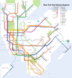
 The New York City Subway map as of May 2018 (freely licensed schematic). The map includes other public transportation systems in addition to the subways.
 The New York City Subway map as of June 2013 subway.
A transit map is a topological map in the form of a schematic diagram used to illustrate the routes and stations within a public transport system—whether this be bus, tram, rapid transit, commuter rail or ferry routes. Metro maps, subway maps, or tube maps of metropolitan railways are some common examples.
The primary function of a transit map is to facilitating the passengers' orientation and navigation, helping them to efficiently use the public transport system and identify which stations function as interchange between lines.
Unlike conventional maps, transit maps are usually not designed to be geographically accurate. Instead, to increase legibility, simplicity and visual aesthetic quality, designers simplify complex routes by using abstract geometry - straight lines, fixed angles and often a fixed distance between stations, compressing those in the outer area of the system and expanding those close to the center. This transformation of a topographical map into a schematic diagram is known as schematization. Although they prioritize clarity over strict geographic accuracy, the relative positions and connections between stations and routes are still accurately depicted for effective navigation. Transit map design places a strong emphasis on user needs, ensuring that layouts and visual elements are optimized to empower passengers with intuitive navigation tools, facilitating seamless decision-making and enhancing overall travel experience.
The main components of a transit map include symbols or named icons representing stations, stops, and interchanges, color-coded lines indicating available routes and transportation services, capturing not only the essential structure of transport networks, but also the city's iconic landscape itself. Its layout, such as geographic, multilinear, radial, concentric circular, grid, or hybrid, is chosen based on geographical intricacies, network complexity, and user preference. Careful consideration is given to icon choice to distinguish different kinds of stations (regular, interchange or terminal), line styles, colors, typography, and their consistent application for clear, effective and intuitive communication.
Transit maps can be found in the transit vehicles, at the platforms or in printed timetables. They are also accessible through digital platforms like mobile apps and websites, ensuring widespread availability and convenience for passengers.
History
The mapping of transit systems was at first generally geographically accurate, but abstract route-maps of individual lines (usually displayed inside the carriages) can be traced back as early as 1908 (London's District line), and certainly there are examples from European and American railroad cartography as early as the 1890s where geographical features have been removed and the routes of lines have been artificially straightened out. But it was George Dow of the London and North Eastern Railway who was the first to launch a diagrammatic representation of an entire rail transport network (in 1929); his work is seen by historians of the subject as being part of the inspiration for Harry Beck when he launched his iconic London Underground map in 1933.
After this pioneering work, many transit authorities worldwide imitated the diagrammatic look for their own networks, some while continuing to also publish hybrid versions that were geographically accurate.
Early maps of the Berlin U-Bahn, Berlin S-Bahn, Boston T, Paris Métro, and New York City Subway also exhibited some elements of the diagrammatic form.
The new Madrid Metro map (of 2007), designed by the RaRo Agency, took the idea of a simple diagram one step further by becoming one of the first produced for a major network to remove diagonal lines altogether; it is constituted just by horizontal and vertical lines only at right angles to each other. After many complaints over its disadvantages, the company reverted to the previous map in 2013.
Transit maps are now increasingly digitized and can be shown in many forms online.
Elements

The primary purpose of a transit map is to help passengers—especially those unfamiliar with the system—to take the correct routes to travel between two points; this may include having to change vehicle or mode in the course of the trip. The map uses symbols to illustrate the lines, stations and transfer points, as well as a system of geographic identification. At the same time the map must remain simple to allow overview, and be usable by those unfamiliar with the geography of the area.
Stations are marked with symbols that break the line, along with their names, so they may be referred to on other maps or travel itineraries. Further help may be granted through the inclusion of important tourist attractions and other locations such as the city center; these may be identified through symbols or wording.
Color coding allows the map to specify each route in an easy way, allowing the users to quickly identify where each specific route goes; if it does not go to the desired destination, the colors and symbols allow the user to identify a feasible point of transfer between lines. Symbols such as aircraft may be used to illustrate airports, and symbols of trains may be used to identify stations that allow transfer to other modes, such as commuter or intercity train services. With the widespread use of zone pricing for fare calculation, systems that span more than one zone need a system to inform the use which zone a particular station is located in. Common ways include varying the tone of the background color, or by running a weak line along the zone boundaries.
Many transit authorities publish multiple maps of their systems; this can be done by isolating one mode of transport, for instance only rapid transit or only bus, onto a single map, or instead the authorities publish maps covering only a limited area, but with greater detail. Another modification is to produce geographically accurate maps of the system, to allow users to better understand the routes. Even if official geographical accurate maps are not available, these can often be obtained from unofficial sources since the information is available from other sources.
Iconic status
There are a growing number of books, websites and works of art on the subject of urban rail and metro map design and use. There are now hundreds of examples of diagrams in an urban rail or metro map style that are used to represent everything from other transit networks like buses and national rail services to sewerage systems and Derbyshire public houses.
One of the most well-known adaptations of an urban rail map was The Great Bear, a lithograph by Simon Patterson. First shown in 1992 and nominated for the Turner Prize, The Great Bear replaces station names on the London Underground map with those of explorers, saints, film stars, philosophers and comedians. Other artists such as Scott Rosenbaum, and Ralph Gray have also taken the iconic style of the urban rail map and made new artistic creations ranging from the abstract to the Solar System. Following the success of these the idea of adapting other urban rail and metro maps has spread so that now almost every major subway or rapid transit system with a map has been doctored with different names, often anagrams of the original station name.
Some maps including those for the rapid transit systems of New York City, Washington D.C., Boston, Montreal, and Denver, have been recreated to include the names of local bars that have a good selection of craft beers.
See also
Notes
- The current subway map is at https://new.mta.info/map/5256.
References
- Álvarez, Pilar (May 31, 2013). "Metro recupera el plano geográfico". El País (in Spanish). Retrieved February 28, 2018.
- "Pubway Maps". Unquestionable Taste. Archived from the original on January 13, 2015. Retrieved January 13, 2015.
Further reading
- Mr Beck's Underground Map, Ken Garland, Capital Transport, London, 1994. ISBN 1-85414-168-6
- No Need To Ask, David Leboff and Tim Demuth, Capital Transport, London, 1999. ISBN 1-85414-215-1
- Metro Maps of the World, Mark Ovenden, Capital Transport, London, 2003. ISBN 1-85414-288-7
- Das Berliner U- und S-Bahnnetz, Alfred B. Gottwaldt, TransPress, Stuttgart, 2004. ISBN 3-613-71227-X
- Telling the passenger where to get off, Andrew Dow, Capital Transport, London, 2005. ISBN 1-85414-291-7
- Underground Maps After Beck, Maxwell J. Roberts, Capital Transport, London, 2005. ISBN 1-85414-286-0
- Transit Maps of the world, Mark Ovenden, Penguin books, New York, 2007. ISBN 978-0-14-311265-5
External links
- Subways Transport, an extensive site with archive maps on virtually every urban rail system in the world.
- Urban Rail
| Public transport | |
|---|---|
| Bus service | |
| Rail | |
| Vehicles for hire | |
| Carpooling | |
| Ship | |
| Cable | |
| Other transport | |
| Locations | |
| Ticketing and fares |
|
| Routing | |
| Facilities | |
| Scheduling | |
| Politics | |
| Technology and signage | |
| Other topics | |