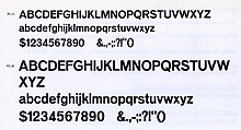
Venus or Venus-Grotesk is a sans-serif typeface family released by the Bauer Type Foundry of Frankfurt am Main, Germany from 1907 onwards. Released in a large range of styles, including condensed and extended weights, it was very popular in the early-to-mid twentieth century. It was exported to other countries, notably the United States, where it was distributed by Bauer Alphabets Inc, the U.S. branch of the firm.
Like other "grotesque" typefaces of the period such as Akzidenz-Grotesk of the Berthold Type Foundry, Venus has a minimal, 'neutral' design, with a monoline structure and an absence of flourishes. However, compared to many later sans-serifs, such as Helvetica and Univers, it has a more irregular design, with stroke terminals at a variety of angles rather than generally exactly horizontal or vertical. A notable feature is the distinctive motif of unusually high-waisted capitals, visible in the 'R', 'G' and 'E'. Walter Tracy describes this as similar to some of the much more adorned Art Nouveau and Secessionist lettering of the period. Original versions had sheared horizontal stroke terminals on 'E' and 'F', but in the later metal-type period it was sold with alternate capitals without these. The 'g' is single-storey and the sloped form is an oblique, rather than a true italic. A double-storey 'g' was also available as an alternate character.
A prominent use of it was Jan Tschichold's second book, Eine Stunde Druckgestaltung (1930), which used it for body text. It was also used in other avant-garde printing of the period. Sainsbury's, a major United Kingdom supermarket chain, used Venus in its logo for many years.
A number of digitisations have been released based on some styles of the family. Monotype's 1920s Grotesque 215 and 216 series, created for their hot metal typesetting system, were also reportedly loosely based on it; the standard Windows typeface Arial is influenced by them.
In 2007, David Berlow published the "Vonness" typeface, closely based on the Venus typeface.
Eric Olson designed the Coordinates typeface, a monospaced sans-serif typeface based on the Venus typeface.
Parachute Type Foundry designed the PF Grand Gothik Variable typeface, a blend of Venus and Interstate, with OpenType features.
Gallery
Notes
- Some sources say 1906.
References
- Alexander S. Lawson (January 1990). Anatomy of a Typeface. David R. Godine Publisher. pp. 298–305. ISBN 978-0-87923-333-4.
- Leonard, Charles C. Paul Renner and Futura: The Effects of Culture, Technology, and Social Continuity on the Design of Type for Printing. Scholarworks (Thesis). Retrieved 13 January 2017.
- Barnes, Paul; Schwartz, Christian. "Christian Schwartz and Paul Barnes deep in the archives: Venus 1907-27". Eye magazine. Retrieved 13 January 2017.
- Jeremy Aynsley (Wolfsonian-Florida International University) (2000). Graphic Design in Germany: 1890-1945. University of California Press. pp. 103─108. ISBN 978-0-520-22796-5.
- Kupferschmid, Indra (6 January 2012). "The True Typefaces of the Bauhaus". Fonts in Use. Retrieved 13 January 2017.
- Philip B. Meggs; Rob Carter (15 December 1993). Typographic Specimens: The Great Typefaces. John Wiley & Sons. pp. 10─11. ISBN 978-0-471-28429-1.
- Budrick, Callie (19 October 2015). "Vintage Fonts: 35 Adverts From the Past". Print. Retrieved 20 March 2016.
- McGrew, Mac (1993). American Metal Typefaces of the Twentieth Century (Second, revised ed.). Oak Knoll. p. 352. ISBN 0-938768-39-5.
- Heidrun Osterer; Philipp Stamm (8 May 2014). Adrian Frutiger – Typefaces: The Complete Works. Birkhäuser. p. 96. ISBN 978-3-03821-260-7.
- ^ Walter Tracy (January 2003). Letters of Credit: A View of Type Design. D.R. Godine. pp. 96, 97. ISBN 978-1-56792-240-0.
- Hardwig, Florian (7 November 2018). "Sexual Politics – Kate Millett". Fonts in Use. Retrieved 20 April 2019.
Bauer recut the E, F and L in all sizes and styles of Venus, straightening the diagonally sheared terminals
- Majoor, Martin (Spring 2007). "Inclined to be dull". Eye. Retrieved 3 August 2015.
- Coles, Stephen. "Bauhausvorhangstoffe ad from C. E. Baumgärtel & Sohn". Fonts in Use. Retrieved 8 August 2021.
- Angela Kottke (4 January 2002). Die Auswirkungen des Bauhauses auf die Buchgestaltung der zwanziger Jahre. Diplom.de. p. 86, 87. ISBN 978-3-8324-4869-1.
- "Sainsbury's packages, 1962–1977". 5 April 2013.
- "Venus". Fonts in Use. Retrieved 13 January 2017.
- "Venus". MyFonts. URW++. Retrieved 17 April 2019.
- Mosley, James. "The Nymph and the Grot, an update". Type Foundry (blog). Retrieved 13 January 2017.
- Shaw, Paul. "Arial Addendum no. 3". Blue Pencil. Retrieved 1 July 2015.
- Shaw; Nicholas. "Arial addendum no. 4". Blue Pencil. Retrieved 1 July 2015.
- "Vonness typeface". Fonts In Use. Retrieved 25 March 2023.
- "Coordinates typeface". Process Type Foundry. Retrieved 13 October 2021.
- "PF Grand Gothik Variable on Behance". behance.net. May 2019. Retrieved 28 April 2023.
- "PF Grand Gothik Variable". Parachute Fonts. Retrieved 28 April 2023.
External links
- Fonts In Use: Venus and Venus breit fett
- Bauer specimen


