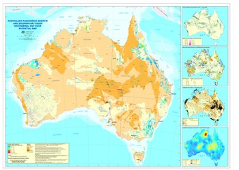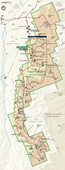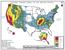
Map layout, also called map composition or (cartographic) page layout, is the part of cartographic design that involves assembling various map elements on a page. This may include the map image itself, along with titles, legends, scale indicators, inset maps, and other elements. It follows principles similar to page layout in graphic design, such as balance, gestalt, and visual hierarchy. The term map composition is also used for the assembling of features and symbols within the map image itself, which can cause some confusion; these two processes share a few common design principles but are distinct procedures in practice. Similar principles of layout design apply to maps produced in a variety of media, from large format wall maps to illustrations in books to interactive web maps, although each medium has unique constraints and opportunities.
Layout principles

While much of cartographic design is constrained by geographic reality (i.e., things are what they are and where they are), the cartographer has more freedom in layout than in designing the map image. Therefore, page layout has more in common with graphic design, with its own principles of layout, than any other aspect of cartography. Another impact of this relationship is that the cartography profession has largely adopted these principles, with relatively less unique research on the topic by academic cartographers than other aspects. The work of Rudolf Arnheim, especially his 1954 Art and visual perception, was especially influential during the formative years of academic cartography, and is still quoted as part of the canon in cartography textbooks. In practice, it is common in publishing teams for the layout portion to be executed by professional graphic designers, not cartographers.
Some of the major design principles that are most applicable to map layout are:
- Attention flow: Map reading is a process, often a complex one, requiring the map user to glean information from the map, and make interpretations and judgments from that information. Thus, this process involves a great deal of shifting attention from one part of the page to another. While the cartographer cannot force the reader to read the map in a particular order as one would a book page, good design can subtly influence the flow of attention in a way that facilitates the use of the map for its intended purposes, such as by reducing the amount of eye movement that needs to take place. Examples of this include designing a map title so that it clearly conveys the map purpose and is noticed at the beginning of the process, and designing legends so that the symbols explained therein can be quickly and easily compared to the corresponding symbols in the map.
- Visual hierarchy: One of the major influences on attention flow is the apparent importance of the elements on the page; what the reader will notice first, second, and so on. As with the symbols within the map image, the map image as a whole, as well as the other layout elements, carry a visual "weight," generally determined by their contrast with the page background and surrounding elements. The cartographer's goal, therefore, is to create a visual hierarchy that matches the conceptual hierarchy of what should be most and least important, or seen first and last, according to the purpose of the map. The use of visual variables, especially size, value (darkness) and texture complexity are especially valuable in constructing a visual hierarchy, as is the wise use of negative space or white space.
- Balance: In its artistic sense, balance is the feeling of the layout being evenly distributed across the page. It is analogous to the physics sense of balance, in which each of the page elements can be thought of as having weight (virtually identical to its weight in the visual hierarchy), and the "torque" created by each weight and its distance from the center of the page should sum to zero. Balance can be achieved passively, through symmetry and the even arrangement of elements (which is easier but often seen as dull), or dynamically, by arranging very different elements in different spacing, but still arriving at balance.
- Order: The elements of the map can be arranged in a variety of ways; their alignment has a strong influence on the flow of attention. As in balance, a passive order is achieved by strictly aligning elements in an even and symmetrical grid pattern; this is often seen as professional but can be dull. A dynamic order introduces some randomness or unevenness in the arrangement, which can give a reaction of interest and enthusiasm, but at its extreme will look haphazard, childish, and cluttered. Another continuum of approaches to layout order varies between a compartmentalized layout, in which each element is set off from the others using neatlines and borders (establishing a clear, strongly organized order, but which often looks stilted); and a fluid layout, in which elements can overlap and flow into one another (establishing a unified, dynamic order, but which can be confusing). Layout design, therefore, is about finding a balance between these various approaches to achieve the best of both worlds.
- Harmony: The elements of the map must not only do their jobs individually, but must also work together, aesthetically and functionally. Visual hierarchy, balance, and order can all be considered as aspects of harmony, but so can the judicious selection of typefaces and colors.
- Gestalt Aesthetic: All of these combine to give an immediate overall impression or emotional reaction in the mind of the map viewer. This is not just a matter of beauty vs. ugliness, but can also include more practical reactions such as clear vs. cluttered, authoritative vs. suspect, or professionally crafted vs. haphazard or amateurish, that directly impact how successful the map will be in achieving its intended purposes.
Layout elements

In addition to the map itself, there are various elements that are included in the map layout. The following are common elements of a map layout.
Map surround
A map surround is any of the supporting objects or elements that help a reader interpret a map. Typical map surround elements include the title, legend, north arrow, scale bar, border, source information and other text, and inset maps.
Negative space
Main article: Negative spaceThe background of the map may seem unimportant at first, but it plays several active roles in the use of the map. It provides "breathing room" between the map elements, and can serve to distinguish elements without the use of borders. Isolating a particular element, such as a title, by surrounding it with wide white space increases its contrast with its surroundings, elevating it in the visual hierarchy.
Most importantly, the background color establishes a baseline with which the map symbols and other elements contrast, establishing the entire visual hierarchy. Four approaches to background color are common:
- The traditional white background of paper maps makes darker elements stand out more.
- A dark background, which has gained popularity recently, especially in Web mapping, with important thematic elements being symbolized with bright or pale colors to make them "glow."
- A medium background, such as a shaded relief image, enables both black and white symbols to stand out, although if not executed well it can also produce a "muddy" appearance in which nothing stands out very much.
- A high contrast background is sometimes used in coastal areas to emphasize the figure-ground contrast between land and water. It essentially partitions the map into a light background land and a dark background sea, which presents challenges for consistent design but can produce a striking effect.
Main map
The primary element on a map page is almost always the map image itself. Placing it in the top of the visual hierarchy is typically done by making it large enough to fill the page, centrally placed, and due to its tendency to be more complex than other elements on the page. Enlarging the map also gives it the maximum possible scale, which maximizes the ability to clearly show detail in the map.
Legend

Legends define the meaning of the map's symbols, especially those that are not already intuitive or obvious. In addition, a legend may also serve other purposes, including: organizing the symbols into a structure of layers and importance; educating about the subject matter; or describing how the map symbology was created. The legend may also give details about the variable being displayed, publication, or authorship. Often, the legend is critical to understanding a map, so it is important that legends are designed effectively. Using principles of gestalt, various sets of rules have been created for legend spacing, alignment, and grouping. The word comes from ancient Latin plural word legenda meaning "things that have to be read".
Title
Titles should be short and to the point. They typically include information about the location of the map and the subject of the map. The title should be an important part of the layout's visual hierarchy because the title tells people what the map is about.
Scale
Main article: Linear scaleScale is important to include on a map because it explains the size relationship between map features and the real world. Scale is commonly represented with a scale bar, a representative fraction ("1:100,000"), or a verbal scale ("1 inch = 1 mile"). The preferred type of scale indicator depends on the purpose and audience of the map: a representative fraction is precise, but most of the public does not know what it means; a very precisely marked scale bar is most useful when distance measurements need to be made, but can be overkill when they do not; many general-audience maps, such as web street maps or atlases, use very simple single-division scale bars to simply give a sense of size.

Inset map
Inset maps are smaller maps that are included on the same page as the main map. They can show additional information related to the main map. Four types of inset maps are common:
- A Locator map is of a significantly smaller scale than the main map, and is used to show the location of the main map within a larger context. They are especially important with an audience who does not know where the mapped region is located.
- A Detail inset is of a significantly larger scale than the main map, to show detail in a more complex portion of the main map.
- A Thematic inset is used to show a different, but related theme, usually covering the same region as the main map.
- An Extension inset shows the same thematic content in a non-contiguous area, such as the common insets of Alaska and Hawaii in maps of the United States.
North arrow
Main article: Compass roseNorth arrows orient readers and tell them which way the map is facing. They are especially important in areas that map viewers are not familiar with, or when the map is oriented such that north is not up. In other cases, they may be unnecessary, especially when the geography is well-known. North arrows can be very complex or very simple.

Text
Supplementary text is used to provide context or explain the map or other map elements. Thematic mapping often uses text to add content that supports the purpose of the map, such as explanations or interpretations of the patterns seen therein. A particular type of text block is the map metadata, which provides background information about the construction of the map. It may be as simple as a citation of the data sources, but could also include information such as the choice of Map projection, authorship credit, copyrights, date of production and/or source data, and construction methods used, chosen based on the purpose and audience.
Images
Non-map images can be added to a layout for a variety of reasons. It can offer a photo view of the area modeled in the map so that a reader can see the location looks like. Images can also be used to show examples of data points or illustrate the methods used to create the map. Logos of agencies or companies sponsoring the map are also a common use of images on layout.
Charts
Charts and graphs can provide a non-spatial view of data to support the purpose map. This allows for data to be visualized in ways that may be more appropriate than a map, such as change over time.A chart can be linked to a table or query and customized by setting various properties. It can even be made interactive.
See also
References
- ^ Muehlenhaus, Ian (2014). Web Cartography: Map Design for Interactive and Mobile Devices. CRC Press.
- ^ Arnheim, Rudolf (1954). Art and Visual Perception: A Psychology of the Creative Eye (1974 2nd ed.). University of California Press.
- Tait, A. (2018). Visual Hierarchy and Layout. The Geographic Information Science & Technology Body of Knowledge (2nd Quarter 2018 Edition), John P. Wilson (ed.). DOI: 10.22224/gistbok/2018.2.4
- Dent, Borden D., Jeffrey S. Torguson, Thomas W. Hodler, Cartography: Thematic Map Design, 6th Edition, McGraw-Hill, 2009, p.209-215
- Krygier, J. & Wood, D. (original edition 2005, latest edition 2016). Making Maps: A Visual Gide to Map Design for GIS. The Guilford Press.
- ^ Tyner, Judith A. (2010). Principles of map design. New York: Guilford Press. pp. 32. ISBN 9781606235447.
- "Layout Essentials | GEOG 486: Cartography and Visualization". www.e-education.psu.edu. Retrieved 2019-12-11.
- Wade, T. and Sommer, S. eds. A to Z GIS
- Tufte, Edward (1990). Envisioning Information (2005 2nd ed.). Graphics Press. pp. 61–65. ISBN 0-9613921-1-8.
- "Building a Legend | GEOG 486: Cartography and Visualization". www.e-education.psu.edu. Retrieved 2019-12-11.
- Schlichtmann, Hansgeorg (1997). "Functions of the Map Legend" (PDF). 18th International Cartographic Conference: 430.
- Qin, Zhe; Li, Zhilin (2017). "Grouping Rules for Effective Legend Design". The Cartographic Journal. 54 (1): 36–47. Bibcode:2017CartJ..54...36Q. doi:10.1080/00087041.2016.1148105. S2CID 132127291.
- Li, Zhilin; Qin, Zhe (2014). "Spacing and alignment rules for effective legend design". Cartography and Geographic Information Science. 41 (4): 348–362. Bibcode:2014CGISc..41..348L. doi:10.1080/15230406.2014.933085. S2CID 62163937.
- ^ "Marginalia Design | GEOG 486: Cartography and Visualization". www.e-education.psu.edu. Retrieved 2019-12-11.
- "Text on Maps | GEOG 486: Cartography and Visualization". www.e-education.psu.edu. Retrieved 2019-12-17.
- "Working with graphic elements, neatlines, pictures, and objects—Help | ArcGIS for Desktop". desktop.arcgis.com. Retrieved 2019-12-17.
- "Chart frames—Layouts | ArcGIS Desktop". pro.arcgis.com. Retrieved 2019-12-17.
| Geography topics | |||||||||
|---|---|---|---|---|---|---|---|---|---|
| |||||||||
| Branches |
| ||||||||
| Techniques and tools |
| ||||||||
| Institutions | |||||||||
| Education | |||||||||