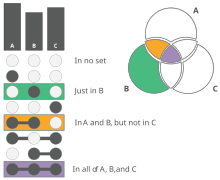
UpSet plots are a data visualization method for showing set data with more than three intersecting sets. UpSet shows intersections in a matrix, with the rows of the matrix corresponding to the sets, and the columns to the intersections between these sets (or vice versa). The size of the sets and of the intersections are shown as bar charts.
History
UpSet plots were first proposed in 2014. The first prototype was implemented as an interactive, web-based application. UpSet plots are related to Mosaic Plots, although Mosaic plots are designed for categorical instead of set data.
UpSet plots became popular as they became available as an R-library based on ggplot2, and were subsequently re-implemented in various programming languages, such as Python, and others. As of January 2024, UpSetR has been downloaded from CRAN more than 1.5 million times, although it was last updated 5 years ago. UpSet plots are now frequently used instead of Venn diagrams, especially in life sciences.
Usage


UpSet plots visualize intersections between sets in a matrix. In a vertical UpSet plot, the columns of the matrix correspond to the sets, the rows correspond to the intersections. For each row, the cells that are part of an intersection are filled in. If there are multiple filled-in cells, they are connected with a line, to emphasize the reading direction of the plot. As sets vary in size, the size of the set is plotted as bar charts on top of the columns. The size of the intersections are shown aligned with the rows, also as bar charts. This layout facilitates the comparison between the sizes of individual intersections, as the size of the bars is easy to compare. UpSets can be used horizontally and vertically.
UpSet plots can be sorted in various ways. A common sorting approach, for example, is to sort by cardinality (the size of an intersection), which places the biggest intersections on top. Alternative sortings are by the degree of the intersection, or by sets.
UpSet plots can also be used to visualize attributes about the intersections by placing attribute visualizations next to the bar charts. Common choices for these attribute visualizations are compact visualization approaches for distributions, such as box plots, or violin plots.
Advanced features of UpSet plots include querying, grouping and aggregating data. These features tend to be available only in interactive, web-based implementations of UpSet.
Benefits and limitations
UpSet plots tend to perform better than Venn diagrams for larger numbers of sets and when it is desirable to also show contextual information about the set intersections. For visualizing diagrams with less than three sets, or when there are only few intersections, Venn and Euler diagram are generally preferred, because they tend to be more familiar and intuitive to read.
UpSet plots are limited to displaying 20-30 sets, though specifics depends on the actual data. An alternative approach for larger datasets is to show a co-occurrence heat map, though these cannot show higher-order intersections
See also
References
- ^ Lex, Alexander; Gehlenborg, Nils; Strobelt, Hendrik; Vuillemot, Romain; Pfister, Hanspeter (31 December 2014). "UpSet: Visualization of Intersecting Sets". IEEE Transactions on Visualization and Computer Graphics. 20 (12): 1983–1992. doi:10.1109/TVCG.2014.2346248. PMC 4720993. PMID 26356912.
- Lex, Alexander; Gehlenborg, Nils; Strobelt, Hendrik; Vuillemot, Romain; Pfister, Hanspeter. ""UpSet - Visualizing Intersecting Sets"".
- Conway, Jake R; Lex, Alexander; Gehlenborg, Nils (15 September 2017). "UpSetR: an R package for the visualization of intersecting sets and their properties". Bioinformatics. 33 (18): 2938–2940. doi:10.1093/bioinformatics/btx364. PMC 5870712. PMID 28645171.
- ^ Lex, Alexander. "UpSet". upset.app. Retrieved 18 February 2022.
- Conway, Jake R; Gehlenborg, Nils (9 May 2019). "UpSetR". GitHub. Retrieved 23 August 2024.
- Gadhave, Kiran. ""UpSet 2: From Prototype to Tool"". Retrieved 28 April 2022.
- Gu, Zuguang. UpSet plot.
{{cite book}}:|website=ignored (help) - Laura, Ellis. "Set Analysis: A face off between Venn diagrams and UpSet plots". Little Miss Data. Retrieved 28 April 2022.
- ^ Lex, Alexander; Gehlenborg, Nils (1 August 2014). "Sets and intersections". Nature Methods. 11 (8): 779. doi:10.1038/nmeth.3033. S2CID 39124565.